Design & observation
What Japan made me notice about design
Washable hospital signs, road signage, pictograms and graphic design. A few examples I researched after returning from Japan, and the questions they bring into my work.
I have just returned from Japan, and I want to keep exploring something that caught my attention: the care given to small details.
I have always been interested in design and iconic objects. I like understanding why something has a particular shape, how it works and what makes people want to keep using it. Coming back from this trip, I wanted to follow that curiosity a little further.
The examples I researched range from washable hospital signs to road signage, wayfinding and graphic design. What connects them is a practical question: what does this detail do for the person using it? It is a question I want to bring into my own work.
Thinking about what happens after delivery
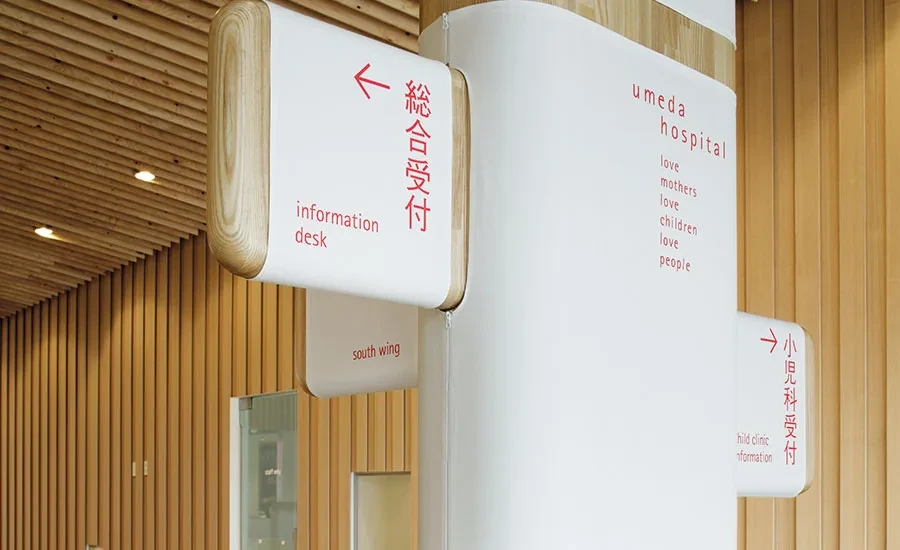
At Umeda Hospital, Kenya Hara designed signs using cloth that covers boards and posts. The fabric can be removed for washing. Kengo Kuma and Associates describes how the signs help soften the atmosphere of the hospital.
This is one of my favourite examples from the research. Someone has thought about how the design will be looked after. The material, the message and the maintenance all belong to the same idea.
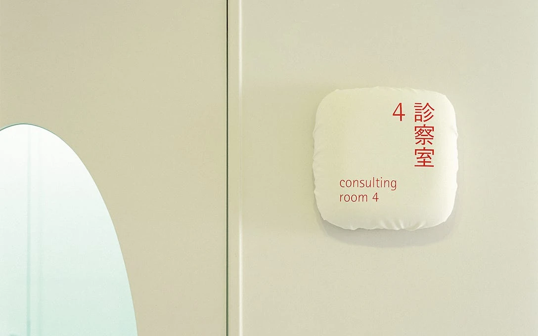
Seeing the smaller signs makes the idea easier to understand. The cloth has edges, folds and a softness that changes the character of the lettering. It is a material choice that also gives the hospital a way to care for the signs over time.

I think about this when a team introduces a new component or pattern. The first version might look great. Later, someone will need to translate it, update the content or handle a situation that the original design did not cover.
I want to understand who will maintain it and how they will make changes. A pattern needs enough guidance to be useful in the hands of someone who was not in the original discussion.
That matters in my work as a manager too. The care we put into a product needs to survive the next release, the next person joining the team and the next difficult request.
Source: Kengo Kuma and Associates, Umeda Hospital
Finding a visual language in the street
I also wanted to look more closely at Japan’s road signage. I like the strong colours, the arrows and the relationship between Japanese and Roman lettering. There is a lot to look at, but the graphic decisions have a job to do.
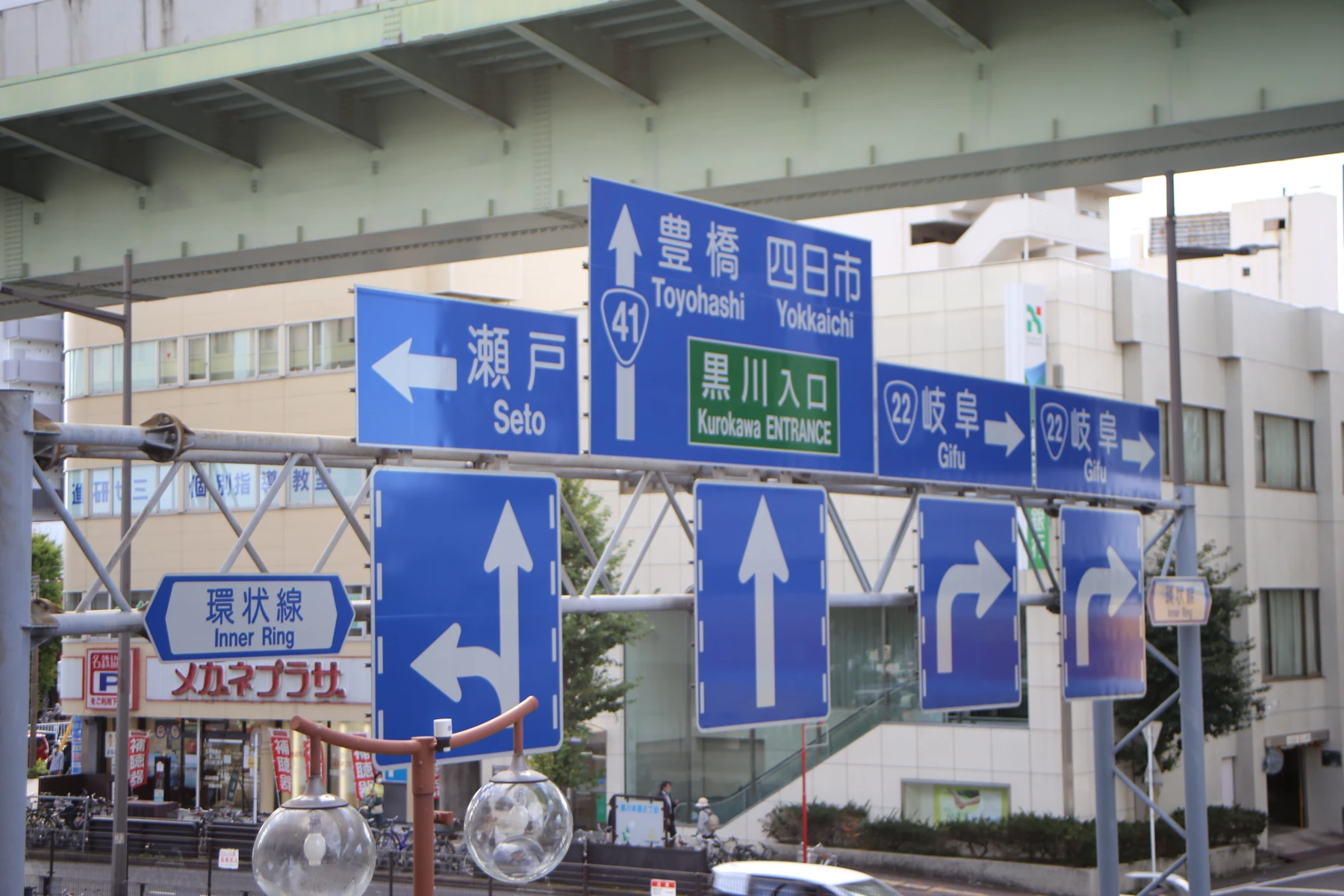

In this photograph, the large arrows establish direction while the place names and route numbers give more specific information. Japanese and Roman lettering share the same space, with differences in size and placement. I find that relationship interesting as a graphic composition as well as a practical one.
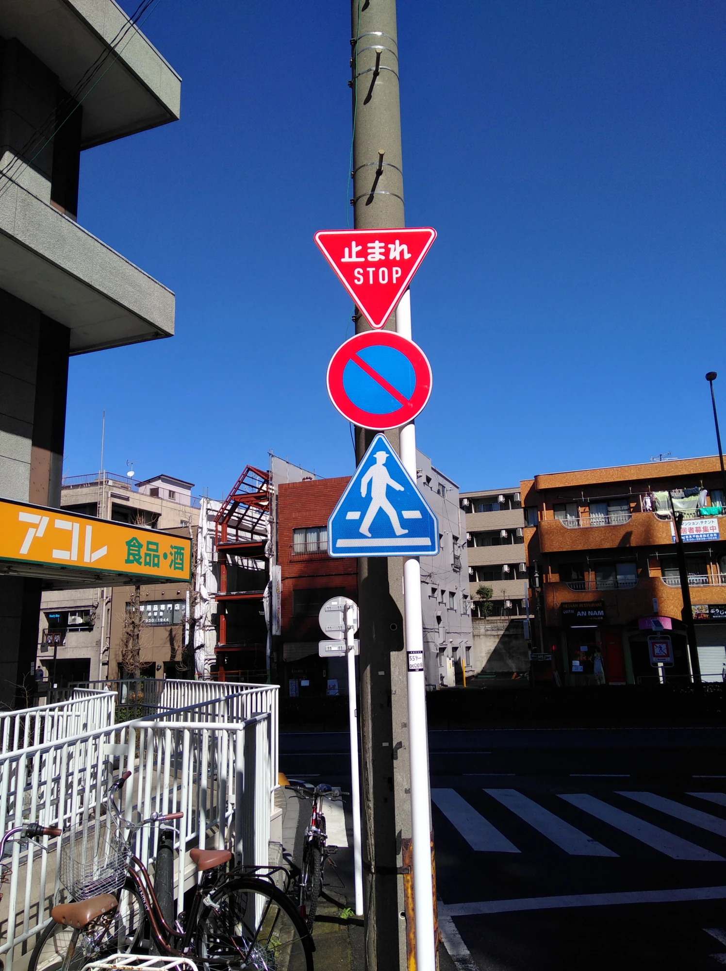

The stop sign is a different kind of message. Its shape, colour and words reinforce one another. Beside the other signs, it also shows how much meaning is carried by the silhouette before someone reads the detail.
That gives me a useful question for interface reviews: what needs to be understood first, and what helps someone confirm it? An icon, a label and a colour can support the same message. I want to check whether they still do that when one of those signals is missing.
Giving people something familiar to follow
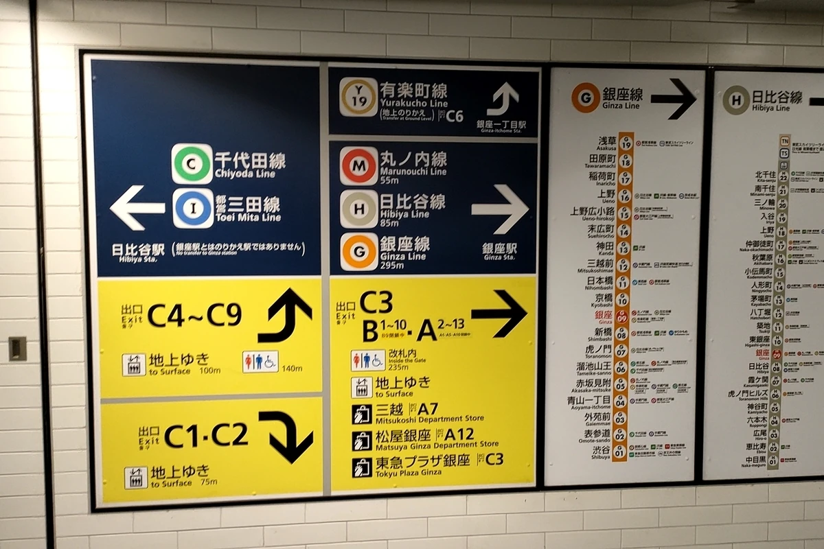
Tokyo Metro combines a line letter, a station number and a coloured ring to identify stations. Its guidance distinguishes blue transfer signs from yellow exit signs, with related information appearing at different points in the journey.
The part I find interesting is the repetition. A person can recognise something familiar as the format and surroundings change. Each sign belongs to a wider system.
That does not remove every difficulty of navigating a large station. Placement and visibility still matter. But a shared language gives people a better starting point.
I see the same need in complex software. A budget, a project or an approval should remain recognisable when someone moves between a table, a detail panel and a message. If the name or meaning changes along the way, the person has to work out whether they are still looking at the same thing.
When I review a design system, I want to follow those relationships through the task. Matching components is useful. Keeping the meaning clear across an experience is just as important.
Source: Tokyo Metro, Before Getting on the Subway
Showing the steps before someone asks
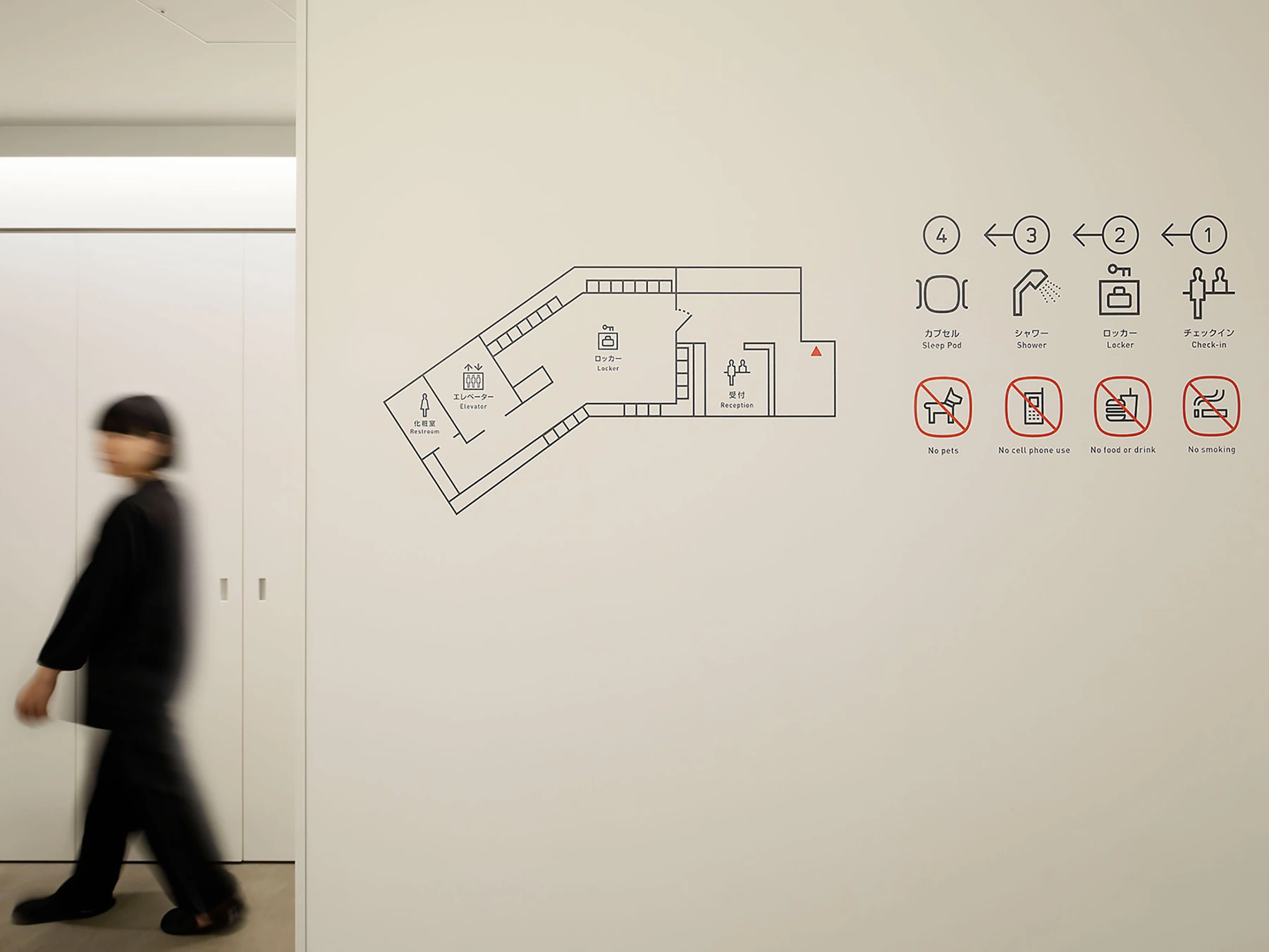
Another example I found is the wall graphics at Nine Hours Woman Kanda. Hiromura Design Office lists the signage project in its portfolio. In the photograph, the icons form a small explanation of the stay: check in, use a locker, shower and sleep.
I like how the numbers, arrows and short labels work together. The pictograms have character, and the sequence gives them a clear purpose. There is also a map for the different question of where things are.
It makes me think about onboarding. Before adding another explanation, I want to see whether the order of the task is visible. What happens first? What will I need? Where do I go next? Those questions deserve a place in the design.
Source: Hiromura Design Office, Nine Hours Woman Kanda, 2017
Making room for character
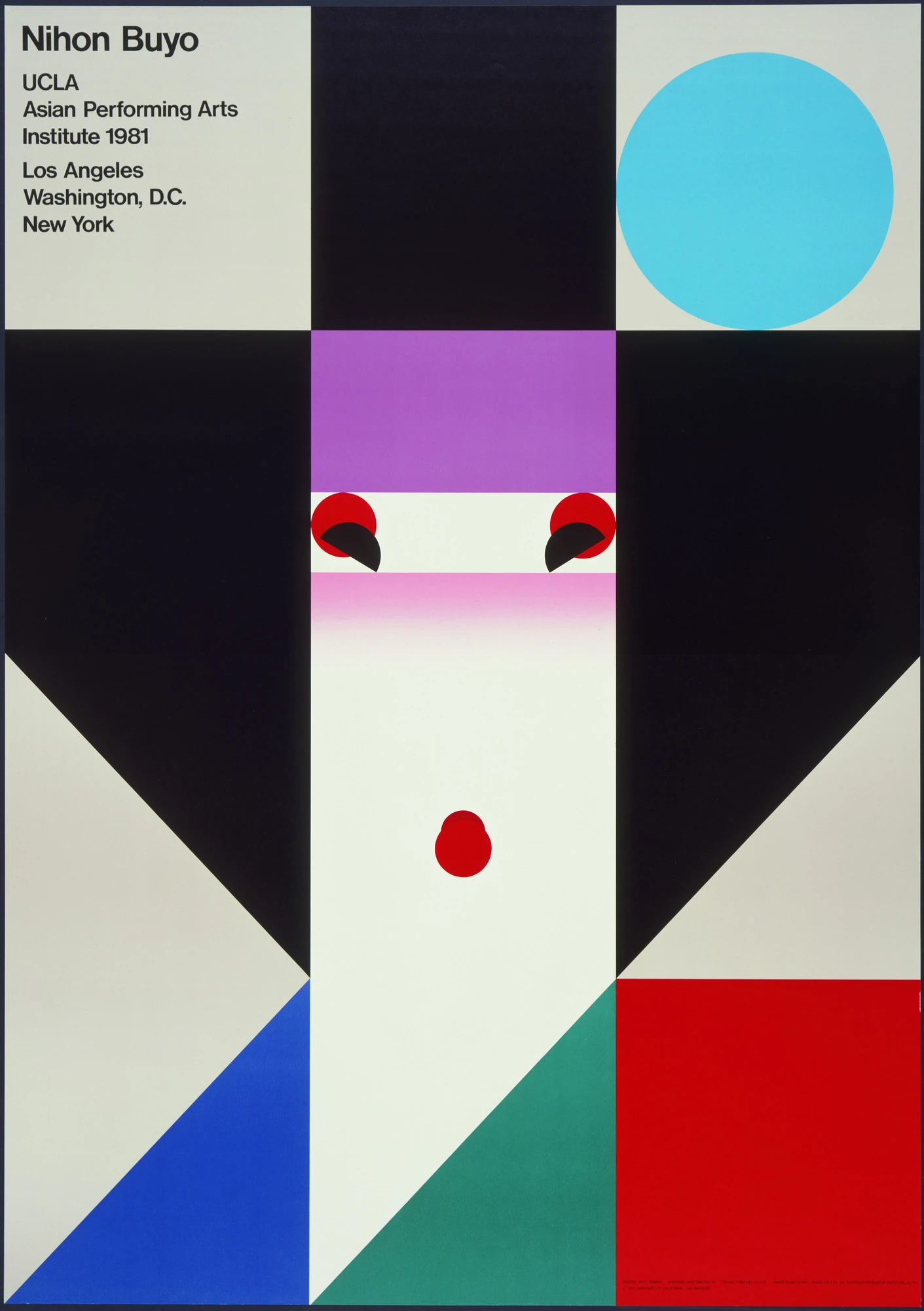
Ikko Tanaka's Nihon Buyo poster from 1981 builds the image of a dancer from geometric shapes and strong colours.
I keep coming back to the relationship between those shapes. The image has a lot of character, even though the construction is controlled. There is a clear idea, and the composition gives it room.
It makes me think about how often precision is associated with making everything look the same. I am interested in precision that helps an identity become more recognisable.
For a poster or an advertisement, I want to understand what should catch the eye first and what someone should remember afterwards. The type, image and spacing need to work together.
An interface asks something different of the person looking at it. There is room for expression, but an important action still needs to be understood. I would be careful about borrowing an unusual visual treatment if it made a task harder to follow.
For me, the useful lesson is to choose where the character belongs. A product can have a distinctive voice while being clear about its actions and consequences.
Source: UMMA, Ikko Tanaka, Nihon Buyo
Letting the visual idea do some work
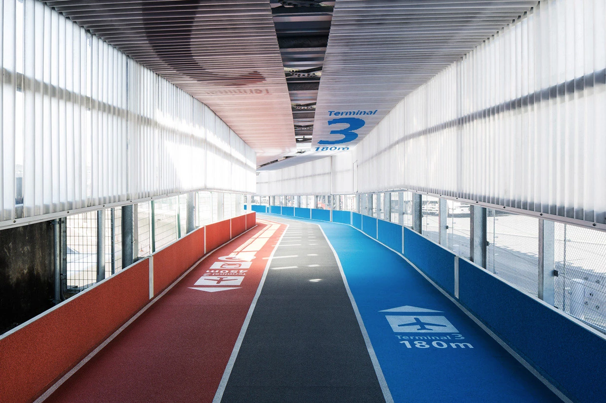
Narita Airport's Terminal 3, opened in April 2015, uses athletics-track-style floor markings alongside larger signs. PARTY credits the airport experience to a collaboration with Nikken Sekkei and Ryohin Keikaku. The signage is also documented by i Design.
I like the connection between the graphic idea and the act of moving through a space. The track becomes part of how the route is communicated.
It makes me think about the way we show progress in a digital product. A visual idea is more useful when it helps someone understand where they are and what comes next.
In a configuration flow, that means explaining what is complete, what still needs attention and whether it is safe to leave and return. I want the visual design to help answer those questions.
Source: i Design, Narita Terminal 3 signage
Bringing that care into everyday work
These examples have given me a more concrete way to think about attention to detail. I can look at a decision and ask what it helps someone understand, do or maintain.
In the software I work on, that might be a budget that keeps its scope visible, an explanation beside a blocked action or a saved view that tells someone what has changed. Those are the details I want to keep discussing with product and engineering.
For a team, it also means giving people time and clear criteria to review the work properly. Care needs to be supported by the way we work together.
I came back from Japan wanting to keep looking, researching and learning. That is also part of why I created FORMA: I enjoy discovering the thinking behind design and sharing it with other people. I want that curiosity to remain present in the products I help build.
Thanks for reading.
Back to the blog ↗